by Caroline Sinders
As a designer, I’m curious about what kinds of identities are encouraged in different comment spaces, and how those identities then go on to affect the conversations that happen. Does the design shape the content?
There’s a lot of focus right now on how the comment section can be full of harassment. What if “don’t read the comments” could be changed via design?
The problem is not just the people within a comment section, but also how the commenting section encourages and allows people to interact. How people form the identities they use alongside their comments is just as much a part of the system of community as the content the users provide. So let’s look closely at the very start of the commenter experience: how you set up your identity on different platforms.
Most commenting systems look the same site to site: users are either required to login via their own social media accounts, or they can set up their own within the system, or as with most systems, the user can choose between these two.

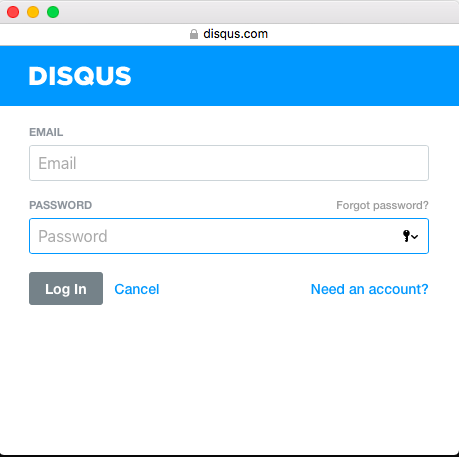
Disqus is probably the biggest commenting service around, implemented by thousands of sites. Its login system creates a micro-community of its own, as the profile or login name a user creates on one site can also be used on any other site using the Disqus system. Sites can choose multiple login methods, including Facebook, Twitter and Google; users are given the option to create site specific names per site, attached to the same profile.
One question that might be worth examining: if a user uses Twitter as their login, does that encourage them to treat the space in a similar way to how they use Twitter? By using Single Sign-On (SSO) for convenience, are we making it harder to encourage different kinds of behavior in a comment space?

Facebook Comments, however, forces the use of real names (or at least what it thinks are real names) everywhere that it is deployed.
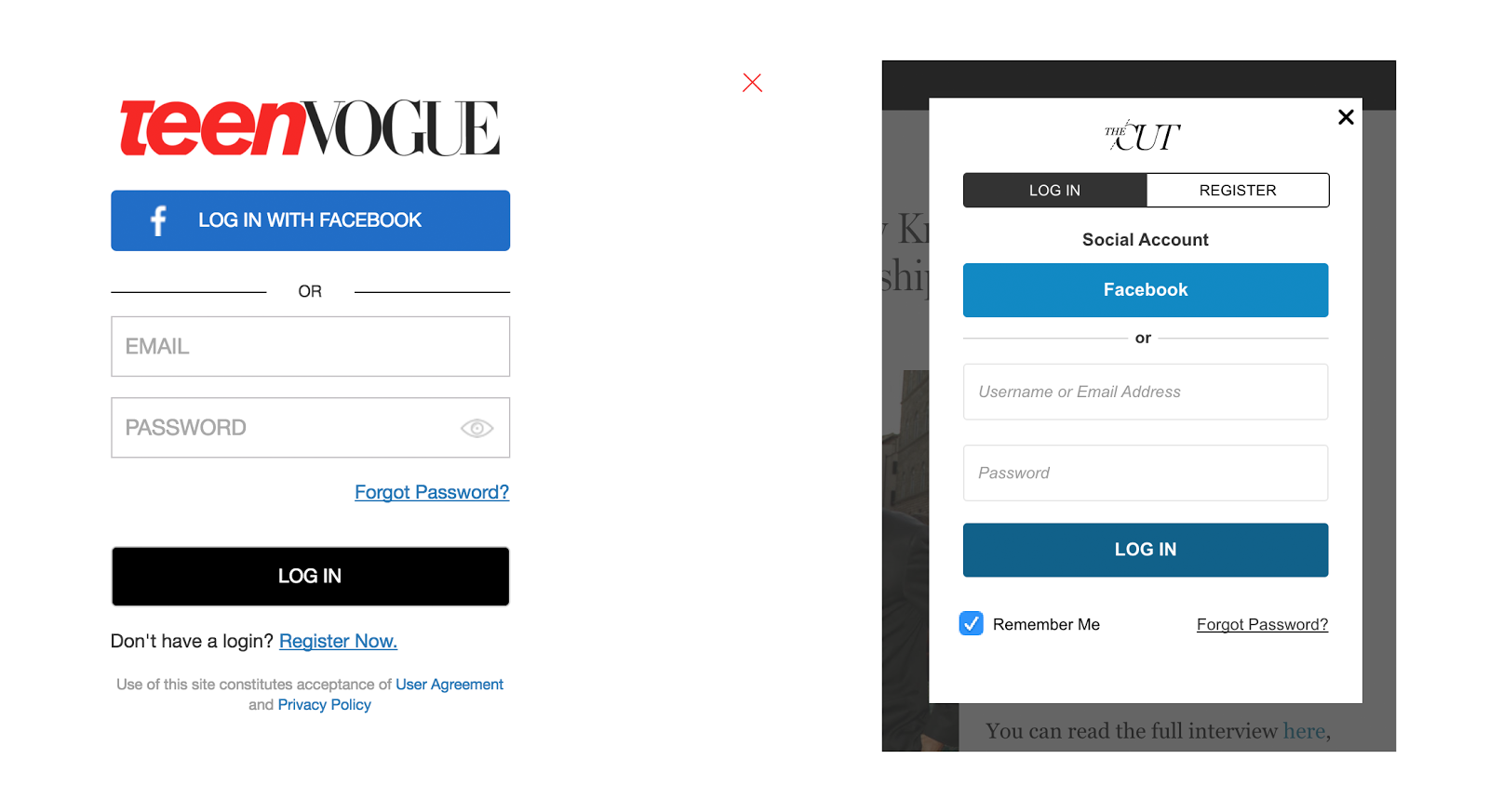
On New York magazine’s website, they use Livefyre, which allows for more customization than Disqus. On New York Magazine’s Vulture website, for example, you either create a new account or use Facebook to log in – which includes the option to choose your own screen name. They don’t offer a Twitter login option. The same is true for Teen Vogue.

What we don’t see, however, as part of the login process is any acknowledgement of what users are agreeing to do once they have an account. Commenting guidelines and privacy policies, if they are findable at all during this process, are hidden behind generic-sounding links.
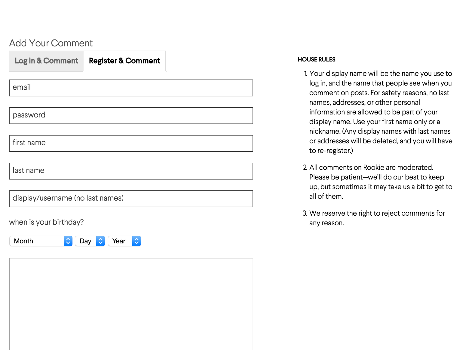
Rookie Magazine, a website started by Tavi Gevinson and geared towards mainly teen girls of all ages, does something quite different. It aims to improve the commenting space during identity creation through subtle design changes.

There’s a lot that’s different here. Firstly, Rookie clearly not only encourages users to create a display name that isn’t their full, real name, but actively doesn’t allow people to make a username that reveals their identity (see point 1 of their House Rules.) Their design both inside the box and in the Rules makes clear that the username is also what will be displayed on the site.
The site’s Code of Conduct is prominently displayed as House Rules right next to the commenting login. And the code is carefully structured: the first point is about protecting you as a user. The second point is also about making you feel safe, as well as setting up your expectations. The third point lacks some transparency about why comments may be rejected, but it does at least make clear that their decision is final.
In her book The Internet of Garbage, Sarah Jeong writes that “if private platforms are to become communities, agoras, tiny new societies, they have to make a real effort to collect the garbage.” Signaling how and why comments are moderated, including the role of the users in that process, is another important challenge for design.
In a future piece, I’ll look at the role of design in garbage collection, and how sites can encourage or discourage good collection with their choices.
What else can sites do to encourage good behavior through the design of their login/onboarding process? Let us know in our Community.
Image by Sydette Harry, used with permission.
Caroline Sinders is a user researcher, UX designer, and artist. She holds a masters from New York University’s Interactive Telecommunications Program where she focused on HCI, prototyping, and interactive storytelling, and a bachelor of fine arts from New York University’s Photography and Imaging Program, where she focused on digital culture, and the future of imaging. Her work focuses on the intersections of ethnography, machine learning, language, data, trauma, and online harassment.
Caroline’s work has been featured in the Contemporary Art Museum of Houston, Style.com, Fusion News, Washington Post, New York Magazine, Babycastles Gallery, IXDA and the 32nd Chaos Communication Congress (32c3). She recently completed a residency at Studio for Creative Inquiry on her Designing Consent Into Social Networks research.

